


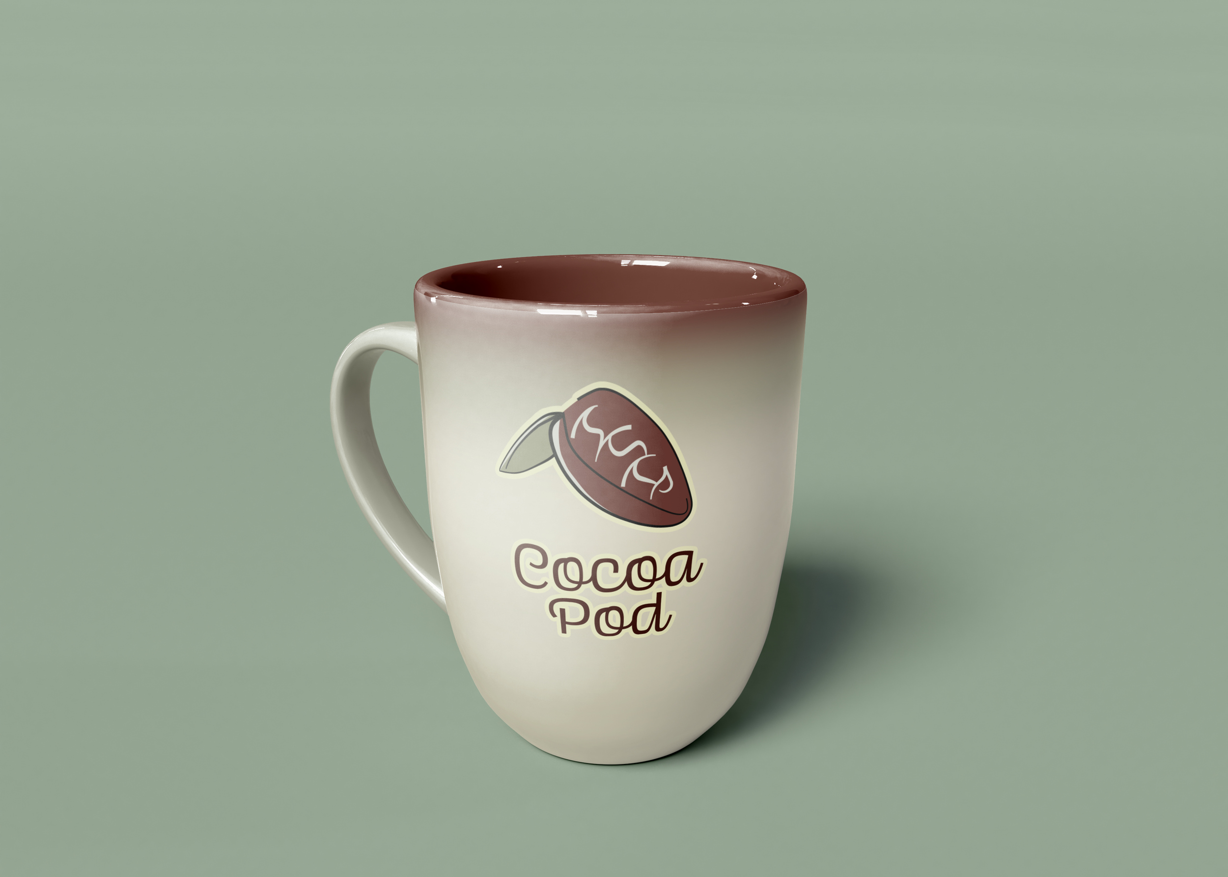
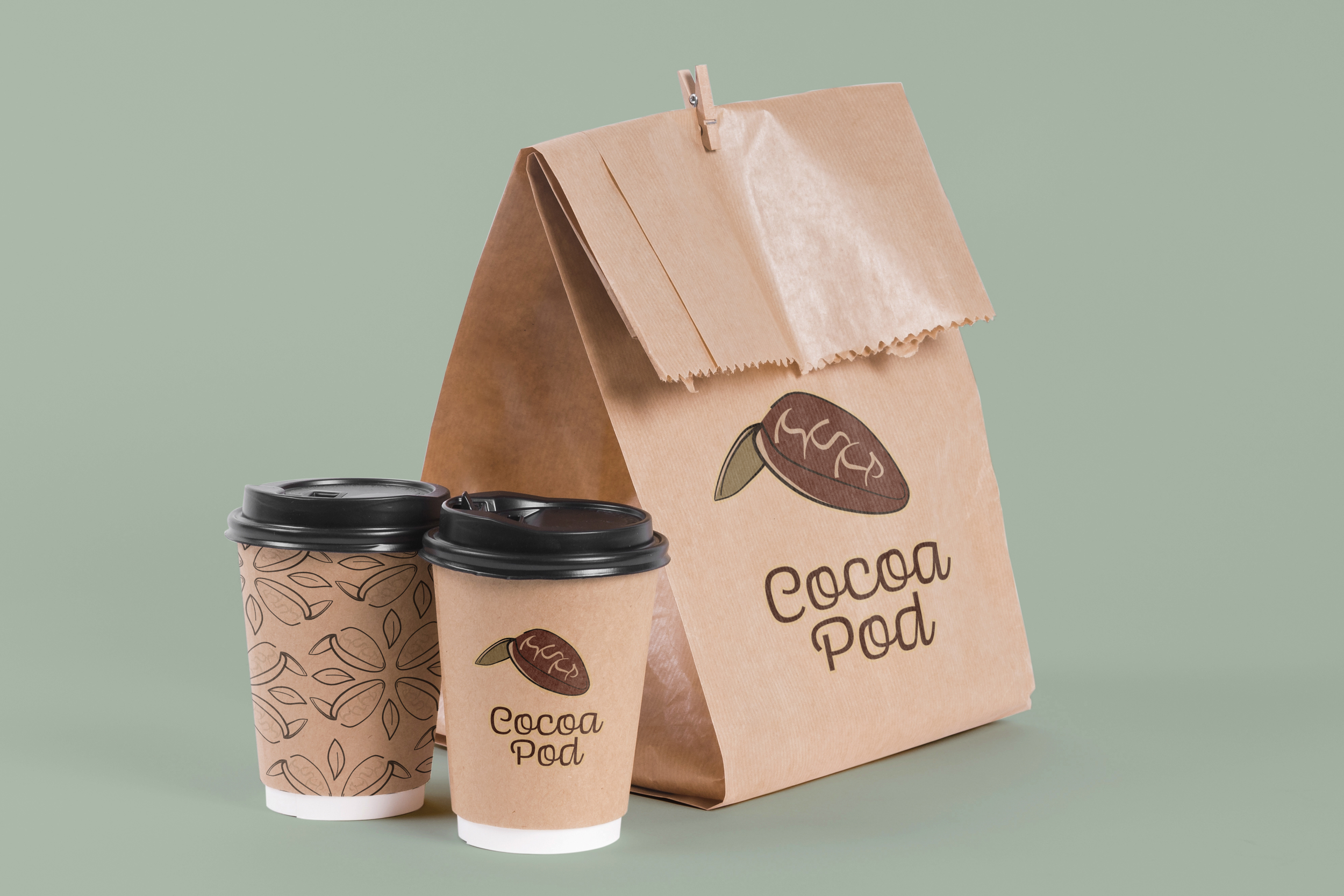
Cocoa Pod
The Cocoa Pod logo was created for a chocolate coffee shop. The brand attributes were elegant, organized, familiar, family-friend and hygge.

This logo was challenging due to how a real cocoa pod is, in all honesty, a bit scary.

The final version of the logo resulted in an eye catching, unique depiction of the fruit. For an in depth view of the brand, I implore you to check the brand book I created.

Lily Pad Balloons
This was a logo created for my Spring 2020 semester at Northern Illinois University. The assignment was to create an animal logo. I decided to use a frog as the logo and made the company sell balloons. The enlarged throat of the frog made this connection work.

